USER RESEARCH | VISUAL DESIGN | PROJECT MANAGEMENT
Drought.gov
Homepage Refresh
THE CHALLENGE
Prior to a complete website redesign and transfer to Drupal 8, our team identified the need to refresh a few keys pages, including the homepage, to increase usability in the meantime. We decided to tackle the homepage first due to:
-
Google Analytics: A large number of users were coming to the homepage then immediately either bouncing or exiting the site via external links.
-
Internal needs: Staff wanted a way to feature program news and events without having to write long news articles.
The Team
My role:
UX/UI Designer
1 Program Manger
3 Developers
2 GIS Specialists
Solutions
As UX/UI designer as well as project manager for the homepage refresh task, I first set about defining our process:

Solutions
01 | USER Research
To empathize with our current users, I conducted a survey in which I received 133 responses. I used a lightbox on the homepage to recruit survey participants and receive feedback from our current users.
In addition, to better empathize with the user I collected 8 interviews with program partners as well as folks from the science community (key audiences for the program). During these interviews, I conducted usability testing for the current homepage, which helped me identify specific user frustrations and expectations.

After compiling and analyzing the user research data, I presented back to the team and created a summary graph to help us focus on user pain points for the next steps of the process:

02 | ANALYSIS
Next on the task list was to start analyzing our existing homepage with the user's pain points in mind:

No description
of drought.gov or what users will find on the site
Users didn't want to read a long paragraph to find out of if drought was in their area
Links take users offsite
Users scrolled right by the news without reading (a few thought these were advertisements)
Usually during this phase, I'd also want to run a competitor's analysis and map out the user's journey, but unfortunately we were pressed for time and decided to incorporate those steps as part of the larger redesign project for the entire site.
03 | IDEATE + Design
At this point, I brought our team back together and led a brainstorm session to determine solutions to our users' pain points. Having all our developers, regional coordinators, and program office staff present for this exercise led to a flurry of ideas and turned out to be a great team building exercise.
For part one of the brainstorm, I asked the team to toss out all and any ideas. For part two of the brainstorm, we narrowed the solutions down to the top 4-5 for each pain point that seemed like the simplest and most viable given our tight turnaround:

04 | Build + TEst + Launch
Keeping in mind our brainstorm and the hierarchy of our user’s needs, I started wireframing layout options. I focused on the core features that the homepage should have to allow our user to achieve their goals and complete the tasks we identified as priorities during our initial interviews and usability testing.
As a team, we picked our top two layouts to run through for A/B testing. From there I worked to on the interface design to match our current branding, but also give the page a refreshed look.
Working with our team of developers housed at the National Center for Environmental Information (NCEI) in Asheville, NC, we built a high fidelity, interactive version of the homepage on our test server for usability testing. During this phase, we also worked through the specifics mobile responsiveness, meeting accessibility requirements, and security issues with connecting to Twitter through a government website.
After 6 design iterations and 4 rounds of user testing, we ultimately launched a new homepage for drought.gov:

Local information easy to find
Links to internal pages to
keep users
on site
Quick sound bites of drought stats
Link to events moved up on the page
Twitter feed showing featuring new content and partner stories
05 | Next Steps
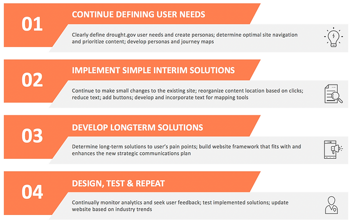
After launching the homepage, we used the same process to update a couple other pages that needed usability upgrade including our state information pages, events pages, and staff page. However, this was just a small part of our big picture plan to really get to know drought.gov users, redesign and migrate the entire site to Drupal 8, and develop website content that aligns with the new strategic communications plan.