Making Greenhouse Gas Data Actionable
Transforming complex greenhouse gas data into accessible insights, interactive tools, and pathways to action for scientists, policymakers, and the public.
The Challenge
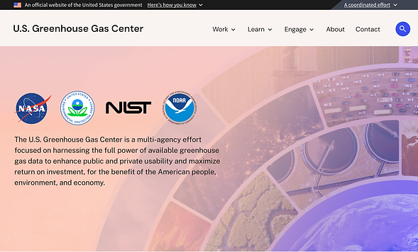
The U.S. Greenhouse Gas Center is a multi-agency initiative focused on making greenhouse gas information more accessible and actionable. Users weren't simply looking for data - they needed to understand emissions trends, evaluate climate actions, and make informed decisions.
I led stakeholder research and translated those insights into a product vision, experience strategy, and design concepts for the next generation of the platform.
My Work
User Research: Interviews, workflow mapping, content audit
Design: Wireframes, visual design, design system, prototyping
Collaboration and Project Management: Stakeholder alignment, facilitating design reviews and iterative feedback sessions
My Role
Senior UX Designer
Our Team
Content Lead
1 Developer
Designer (me)
Software
Figma
Section 508 Accessibility
Drupal

Key Outcomes
Through stakeholder research, experience strategy, and information architecture design, the project established a foundation for making greenhouse gas information more actionable and relevant to diverse audiences.
Better Decision-Making
Created pathways that help users answer climate-related questions and identify relevant actions, resources, and supporting evidence.
Insight-Driven Discovery
Shifted the experience from dataset navigation to question-based exploration through locations, sectors, and topics.
Accessible Climate Intelligence
Made complex greenhouse gas information easier to understand through visualizations, explainers, maps, and contextual content.
Strategic Alignment
Established a shared vision across partner agencies for how the platform could support climate research, policy development, and public understanding.
User Research + Interviews
Through stakeholder conversations, a recurring issue emerged:
The platform was trying to serve everyone, but wasn't fully optimized for anyone.
Researchers wanted direct access to datasets and analytical tools.
Decision-makers wanted answers to questions like:
-
What is happening in my region?
-
How are emissions changing?
-
What actions are working?
-
What should I do next?
The existing experience centered primarily on datasets and scientific resources, making it difficult for less technical audiences to find actionable information. Our team needed a framework for balancing scientific rigor with accessibility.
To further define user needs, I conducted stakeholder interviews across participating agencies and subject matter experts involved in greenhouse gas monitoring, policy, and communications, resulting in four major takeaways:
1
Geography Was the Primary Entry Point
Stakeholders consistently described beginning with places they cared about rather than datasets. Users wanted to understand emissions, trends, and impacts within a specific state, region, city, or sector, making geography a natural starting point for exploration.
Design response: Interactive maps, regional pages, location-based navigation
2
Users Needed Multiple Levels of Detail
The platform needed to support everyone from scientists seeking raw datasets to policymakers looking for high-level insights and trends. Rather than creating separate experiences, the opportunity was designing pathways that progressively revealed complexity based on user needs.
Design response: User pathways, layered information architecture, progressive disclosure
3
Users Need Help Turning Information Into Action
Users were often trying to evaluate policies, understand impacts, measure progress, or identify potential solutions. They needed more than access to data. They needed context, examples, visualizations, and supporting resources that helped them interpret information and make informed decisions.
Design response: Data visualizations, explainers, case studies, decision-support content
4
Trust Enables Action
Users could not confidently act on information they didn't trust. Building trust wasn't just a credibility requirement - it was essential for helping users confidently use greenhouse gas information to support research, policy, planning, and climate action.
Design response: Clear data provenance and methodologies, communicate uncertainty and limitations, links directly to the underlying data and supporting evidence
Designing for Decisions
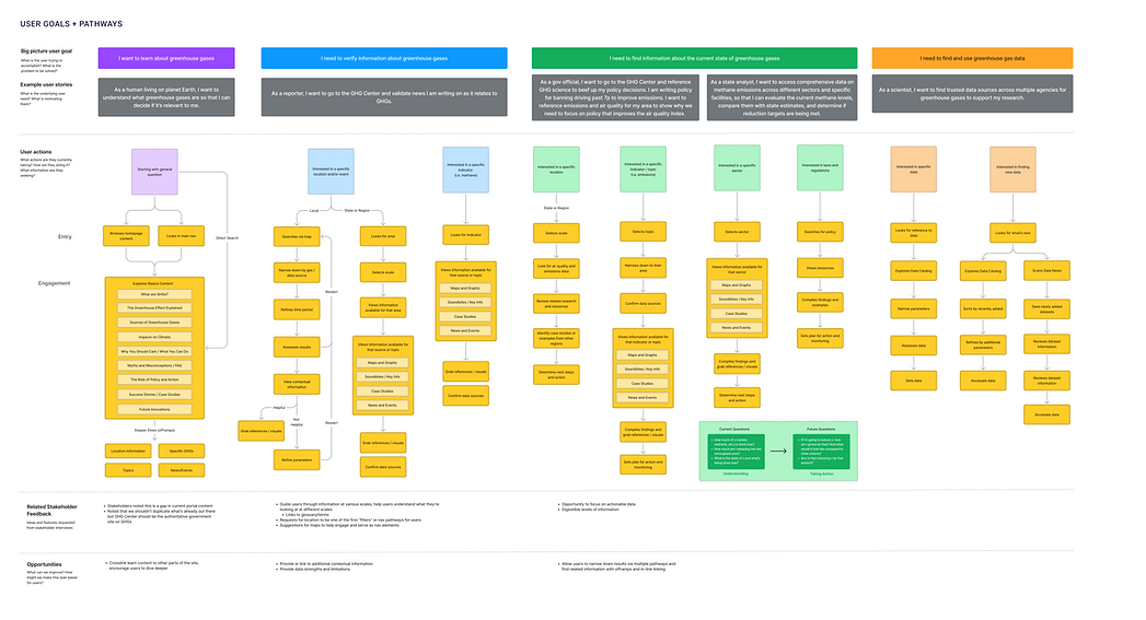
To better understand these needs, I mapped key user goals, motivations, and decision-making journeys, identifying common pathways users followed when exploring greenhouse gas information.
The information architecture was designed around the decisions users were trying to make rather than the datasets available within the platform. By organizing content around locations, sectors, topics, and actions, the experience helped users move from questions to insights and ultimately to informed decision-making.
Key dataset discovery pathways synthesized from user flow mapping and stakeholder research.
.png)
Translating research insights into a user-centered information architecture organized around locations, sectors, topics, and actions rather than datasets, creating clearer paths to discovery and insight.
Turning Data Into Action
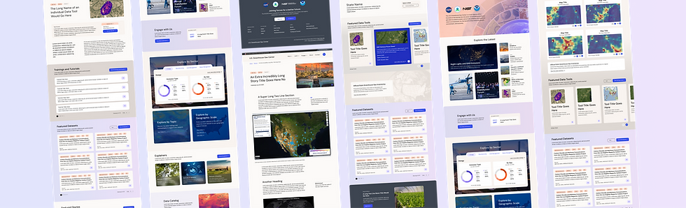
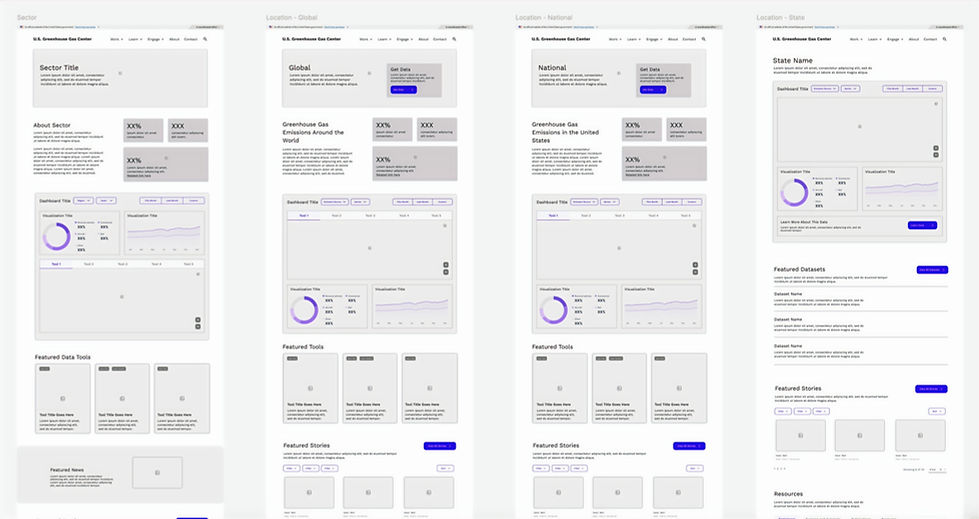
With the information architecture and user pathways established, I translated the strategy into a series of wireframes and concept designs that explored how users could discover, understand, and act on greenhouse gas information. Early wireframes focused on navigation, content hierarchy, and integrating multiple entry points through locations, sectors, topics, interactive maps, and data tools.
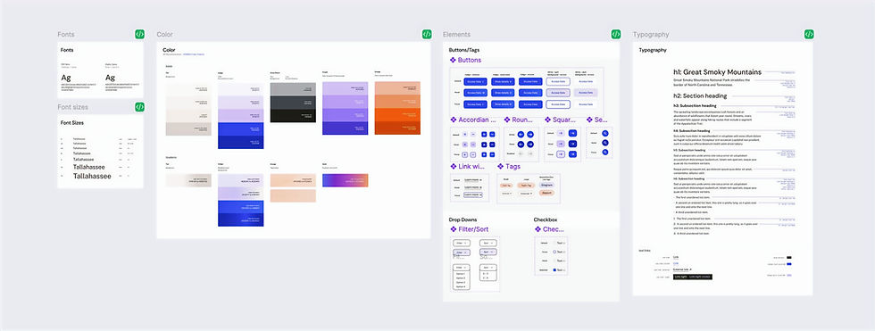
As the designs evolved, I developed a flexible design system that established reusable patterns for navigation, content pages, interactive maps, data visualizations, dashboards, and storytelling experiences. The resulting high-fidelity concepts balanced scientific credibility with accessibility while creating a scalable foundation for future growth. By combining a cohesive visual language with consistent interaction patterns, the platform could support diverse content types and user needs while maintaining a unified experience across the ecosystem.
Visualizing Climate Decisions
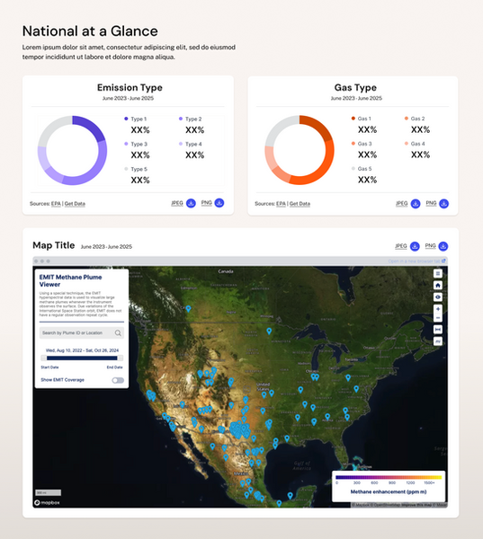
A key design goal was helping users connect data to decisions. Rather than simply displaying data, the mapping experience was designed to help users answer questions, uncover insights, and make informed decisions using greenhouse gas information.
Specifically, I focused on building tools that allowed users to:
-
Compare emissions and trends across locations and time periods
-
Explore multiple data layers to uncover patterns and relationships
-
Drill from high-level geographic insights to supporting data and evidence
-
Connect map findings to relevant actions, resources, and case studies
A Platform for Climate Intelligence
The final designs reimagined the Greenhouse Gas Center as a decision-support platform rather than a data repository. Through interactive maps, visualizations, explainers, and connected content pathways, users could investigate emissions trends, compare regions, understand impacts, and access the information needed to support climate-related decisions with confidence.